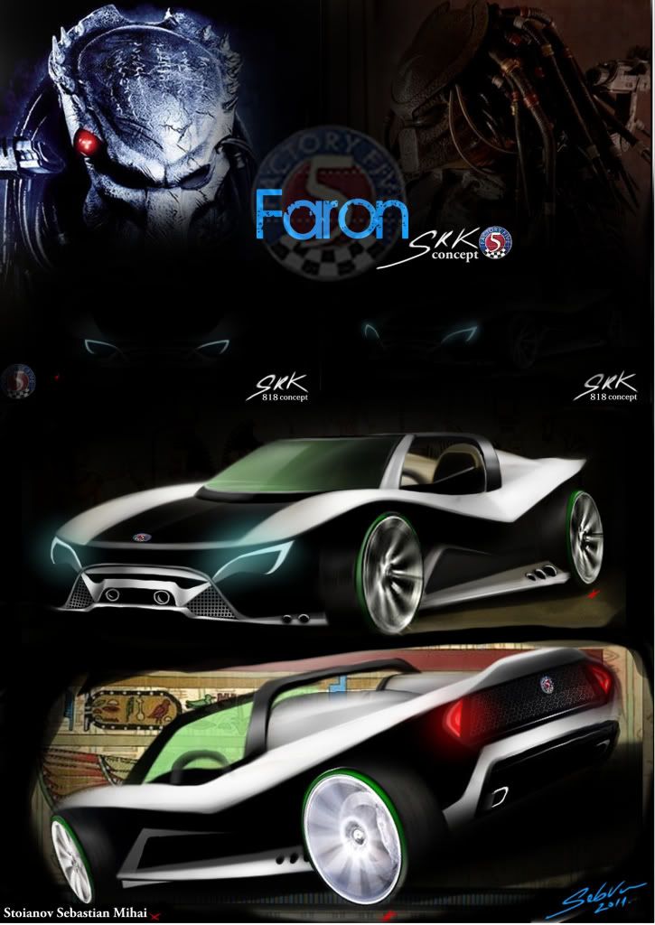
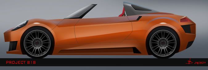
Hi everyone, This is my submission to the Factory five contest, Let me know what you guys think about it. Hope you like my Faron SRK 818 !
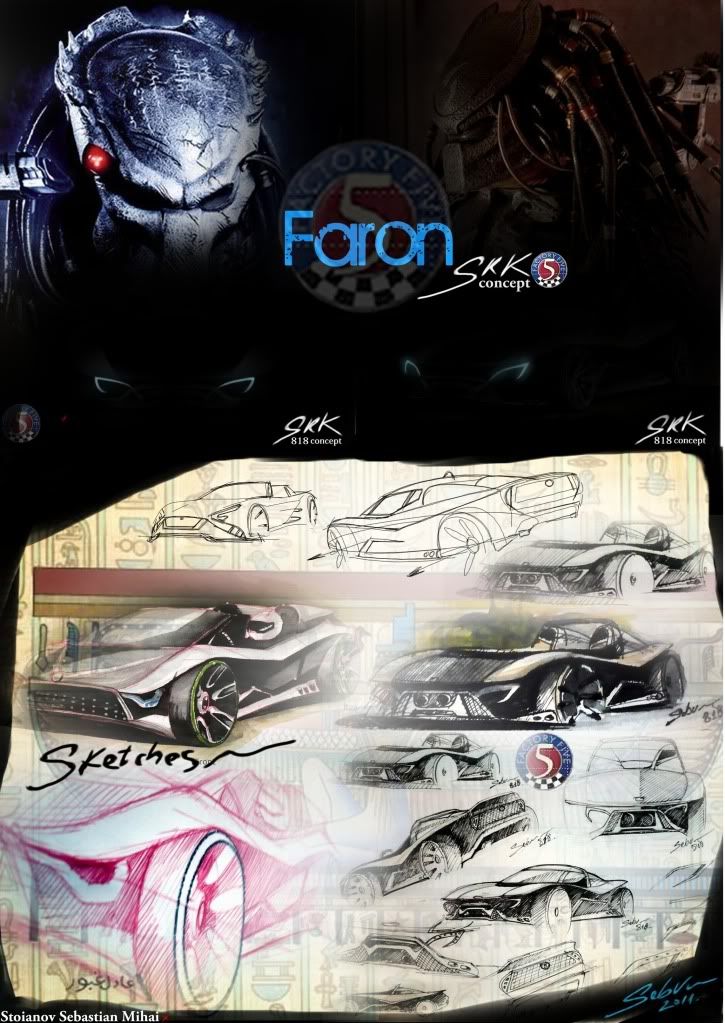
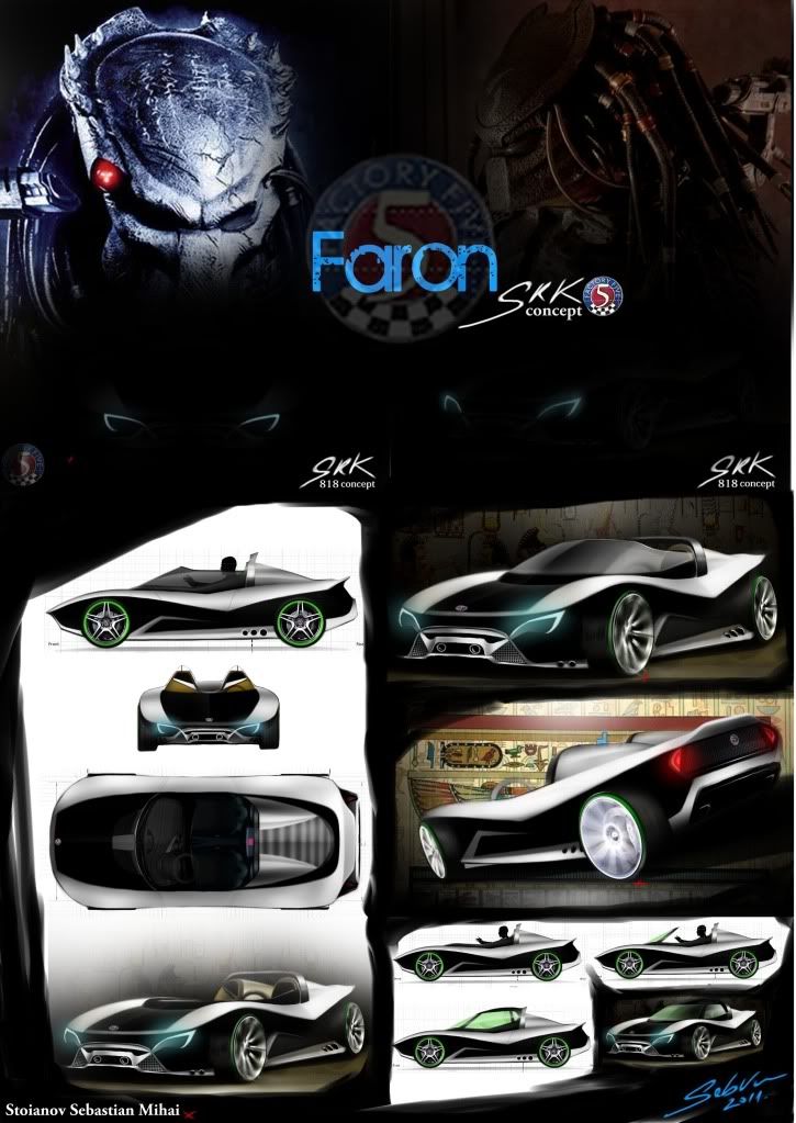
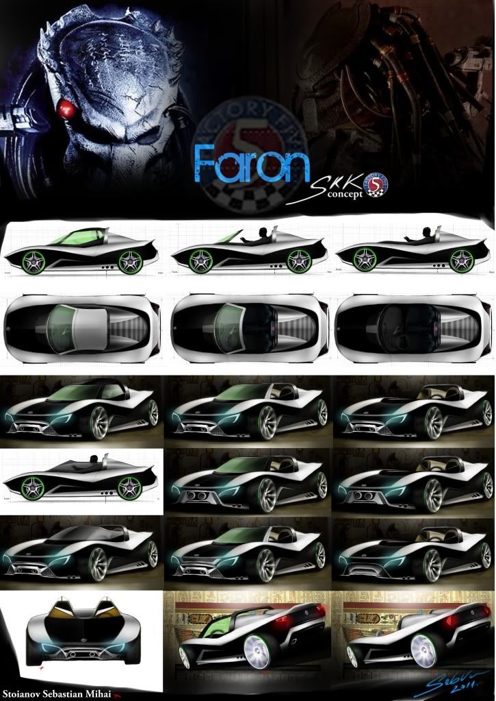
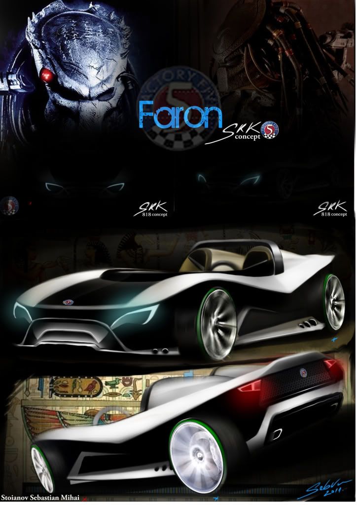
Good luck to everyone!
Cheers!
Hi everyone, This is my submission to the Factory five contest, Let me know what you guys think about it. Hope you like my Faron SRK 818 !


Good luck to everyone!
Cheers!
Hi there! I'm back. First of all I want to say thank you for your comments..... I really didn't expect such a positive reaction.
I'm well aware that my concept is far from perfection; it would probably blow the budget of 15,000 $, as someone of you have noticed, and I know that it has some practical problems (huge blind spots on the rear, due to intercooler air intake), but my intention was to open some new ways of thinking about 818 project (and of course to win the first prize of 5,000 ![]() ).... This would be great for me...
).... This would be great for me...
I really like many of other submissions: Xabier (the Racing version rocks!), Ernesto Freitas, Team KT, Krozn, and I'm looking forward to know which one will be the jury's choice.
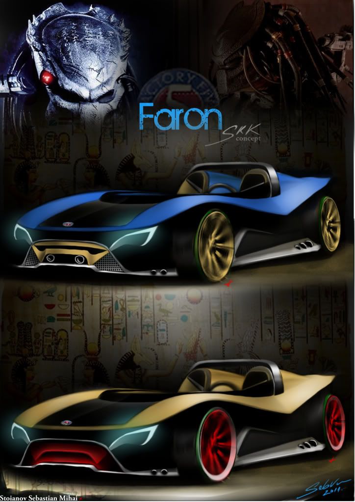
And now, as requested, I post here a black version of my concept (with golden rims as a tribute to the donor car).... Maybe I will have the time for trying other colors and, who knows, for a track version.
Let me know what you guys think, hope you like it.
Mario


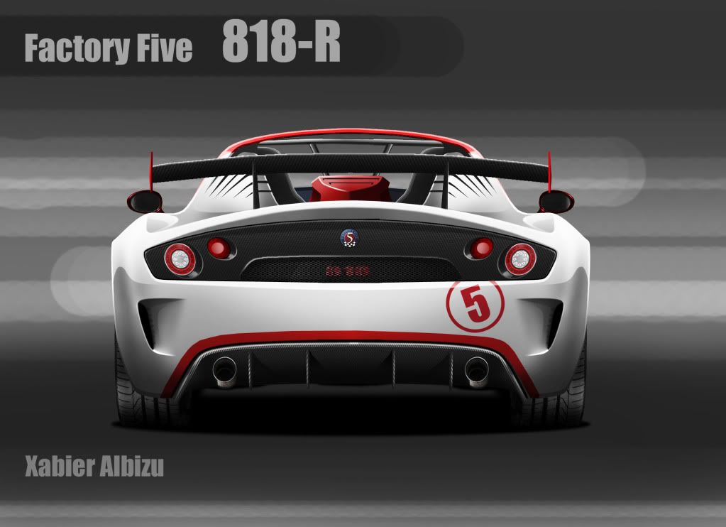
Today I have been able to finish the rear view of the racing version of my design as some asked, so here it goes, I suppose this is the last thing I am going to do before the deadline. Now, good luck everybody!! It has been really nice to take part and thanks everyone for their comments, I really appreciate all of them! Hope you like it!
Hi everyone ![]() here is a render test of the design I'm hoping to submit, time is getting short
here is a render test of the design I'm hoping to submit, time is getting short ![]() , I'll post some more renders as soon as get them done.
btw there are so many kick ..ss designs here, very inspiring.
-cheers
, I'll post some more renders as soon as get them done.
btw there are so many kick ..ss designs here, very inspiring.
-cheers

RodneyO wrote: Hi everyonehere is a render test of the design I'm hoping to submit, time is getting short
, I'll post some more renders as soon as get them done. btw there are so many kick ..ss designs here, very inspiring. -cheers

Wow, this is really good! A lot of styling cues from the roadster.
I really like the way you've wrapped the seat with the curved piece that goes behind the headrest. Did you plan for a top?
unclebigbad wrote:Franze wrote: Hi all my final submissionI like it, that rear end is killin'em!
cheers!
Great design people.
Here's my submission. What you guys think?
Hey guys this was my submission.
It's a roadster with a removable top.

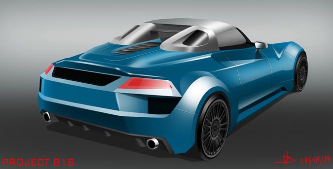
What do you guys think?
In reply to Bluewinters21:
Nice work. One question: With this being a mid-engine design, why do so many designs look like they're hiding the engine up front? The elongated front end. The high hood lines. I think a mid-engine would actually create a reverse effect. The area behind the driver should be longer and the front and rear strike a somewhat equal or slightly forward position.
Just my 2 cents.
There have been some incredibly good entries over the last few days. Thank you all for the hard work!
We'll be accepting entries until 23:59:59 on June 1, so if you haven't sent it in yet, you'd better get hopping. Please be patient as I get them all sorted and in the hands of our judges. I'll be sending confirmation to all participants shortly thereafter to confirm your contact information.
Good luck to all entrants!
Idesign wrote: I've been watching the development of so many good concepts for the last three months while working feverishly on one. I thought I'd join in the fun of sharing on the board before the deadline.5-31-sample
sweet
To freenrgy2,
I know. I really wanted to do a cool sporty little design like a Miata, lotus elise, or Porsche... But I found out about this contest three days ago. No time to think about it. Just do it. I stayed up three days straight to have an entry to turn in. My entry is a result of absolutely no planning. I guess it shows. But I would rather have this abortion of an idea to turn in than nothing at all. ![]()
Here are some more renders from different angles, thanks for the feedback, I will try and change the headlights as well =), If you have any more thoughts let me know, I will post new versions soon that have the top on.
cheers,
-Rodney


RodneyO,
Why do you want to change the headlights? They look cool. The car looks like it's in a bad mood. Or maybe it just wants to run. ![]()
Spezz wrote: Great design people. Here's my submission. What you guys think? Hey guys this was my submission. It's a roadster with a removable top.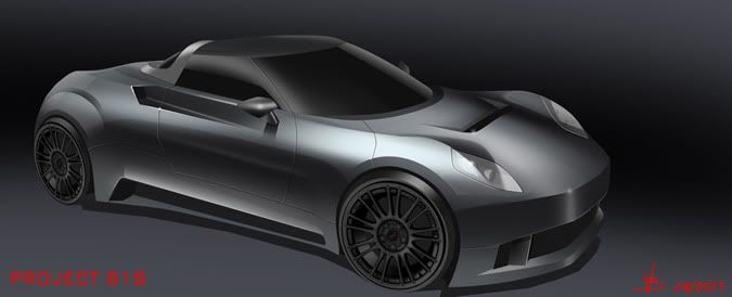

What do you guys think?
I think this is my new favourite ![]()
RodneyO wrote: Here are some more renders from different angles, thanks for the feedback, I will try and change the headlights as well =), If you have any more thoughts let me know, I will post new versions soon that have the top on. cheers, -Rodney


Very cool Rodney! I like it a lot.
At first I wasn't sure about the headlights, but they are growing on me. I wonder if you just got rid of the white outlines so they looked just slightly less like eyes if that would help? Not sure, but the overall design is very cool!
deadline is up. best of luck to everyone, i'm just glad i'm not a judge...somebody's gonna be drinking ALOT of coffee to get through so many top notch entries.
Rodney, that's a mean lookin' little SOB ![]() i really like how you have those little brake ducts matched by the exhaust pipes in the back. very cool detail.
i really like how you have those little brake ducts matched by the exhaust pipes in the back. very cool detail.
RodneyO wrote: Here are some more renders from different angles, thanks for the feedback, I will try and change the headlights as well =), If you have any more thoughts let me know, I will post new versions soon that have the top on. cheers, -Rodney
Congrats! This just became my background. Seriously dude, this is freakin' awesome!!! The stance and lines are incredible. I love the way you wrapped the molding around the seat.
I'm a sucker for honeycomb and I can see that you needed to be careful so as to not look too Camaroish (I just invented that word..TM). Perhaps making the grill more oval or 289 style for more roadster like appearance.
Shoot, when I saw this, my first reaction was to stick a Coyote in this. Can you imagine.
Factory Five, here's the Mk 5!!!!
You'll need to log in to post.