Fiat Multipla. Just look at that transition between the windshield and the hood:

I loved it, but it sure wasn't pretty! Turner 950S I think the Studebaker Avanti is really pretty from every angle too.

In reply to Woody :
Best I can say about them is "Oddly compelling".
The Tesla "No Grill" look does the same thing for me

I don't mind the MCA Centenaire.
NOHOME said:The Tesla "No Grill" look does the same thing for me
I like the lack of grill from the perspective of clean design, but Telsa makes the area stand out too much on the 3, rather than make it look cohesive.
NOHOME said:
The Tesla "No Grill" look does the same thing for me
Agreed. Front end is horrid. The S looks 10x better on the front.
BFH_Garage said:Both seen at a show in Roanoke, VA last year
Oh my, what an excellent example. That is truly, hideously massively awful.
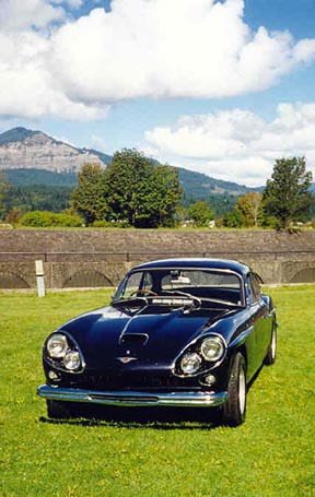
Trent (Generally supportive dude) said:While not the ugliest ever, the Daimler Dart is at best "ungainly"
That is an unfortunate looking car.
Adrian_Thompson (Forum Supporter) said:BFH_Garage said:Both seen at a show in Roanoke, VA last year
Oh my, what an excellent example. That is truly, hideously massively awful.
I said the same thing at a car show then immediately noticed the car's proud owner seated in a lawn chair right behind me ![]()
Since I haven't since it here yet, may I present to you the Subaru Impreza Casa Blanca:

Japan really had a thing for neo-classical design in the '90s.
Trent (Generally supportive dude) said:While not the ugliest ever, the Daimler Dart is at best "ungainly"
Hey - the bottom feeder look of the SP250s was the only car that could distract people at the car shows away from my Jensen CV8, which also had...idiosyncratic styling. The benefit of the Jensen was serious performance - fiberglass body with built big block sixpack engine (in my car)

Not too ugly overall, but one of the weirdest design issues. They way they made the rear doors with a swooping line meeting a sharp crease make every one of these look like it was hit in the rear door. I was shocked when I realized they did that on purpose. This pic shows it, but very obvious in person.

Oh, I've got a few.
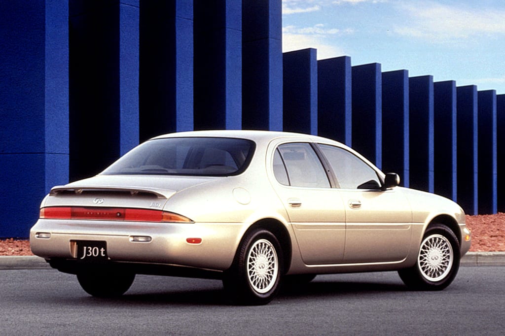
How about the Infinti J30, aka "The Frumpback Infiniti"? What were they going for here stylistically? These only lasted for a few short years here in the states.

While the 1st Gen Camry Solara looks pretty decent, the 2d Gen looks like a large, beached ocean-dwelling creature, especially from the rear.

The 3rd Gen Taurus was so, so bad. Ford's designers took their obsession with ovals way too far! And the SHO's mini Hitler Mustache spoiler... what were they thinking? The design was bad enough that the car never recovered sales-wise.

And the ovals extend to the inside as well!

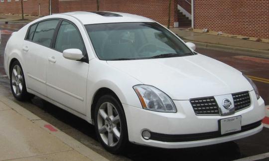
Last one for now: the 2004 Nissan Maxima. The first of many baffling designs from Nissan in the early 2000's to the present day. Skunk stripe glass roofs, derpy fog lamps, flying buttresses on the rear window, and a strange grille featuring chrome that would all but flake off in less than 5 years all made for one homely car. At least you could still row your own for a few years before the dreaded CVT's showed up.

You'll need to log in to post.