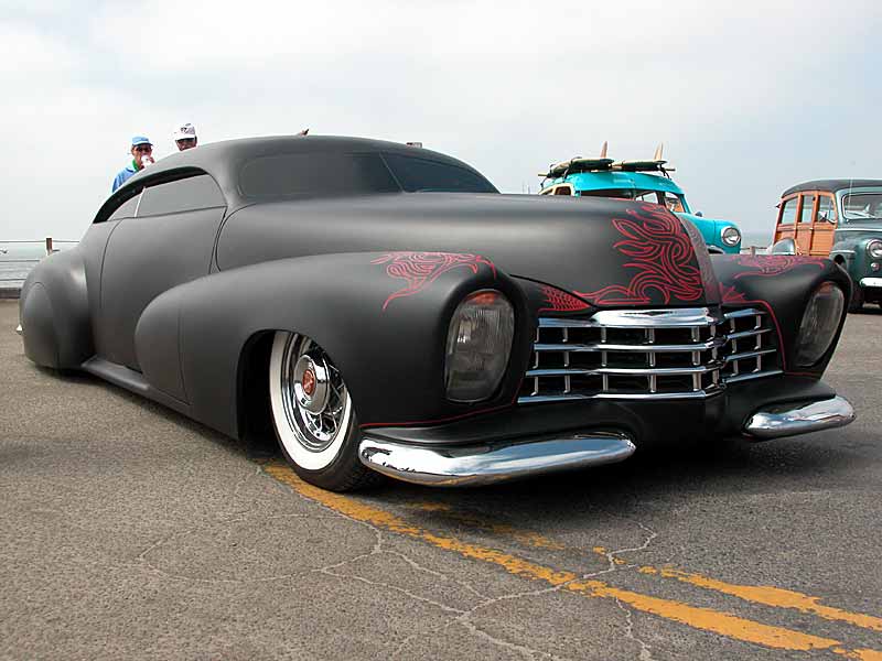
Is this the inspiration for new Mazdas?

The spaceship from Heavy Metal.

the styling of modern cars is a result of the people that are designing them being raised on a steady diet of bad anime and movies from the "Fast and Furious" franchise.
i must say that i wouldn't have a problem with anime styling cues if Voltron (cats, not cars) was an inspiration..

Not sure but I think this may have started things not too long ago. Didn't help they put it in the Transformers' movies.
ReverendDexter wrote: Call me completely bass-ackwards, but I actually prefer '80s styling. Aesthetically, I prefer the Mk II Supra to the Mk III and definitely over the Mk IV; I think the C4 is a much better looking Corvette than the C3; 80s Civic hatches over any newer Civic; Foxbody notches to just about any newer Mustang; etc, etc, etc. I even think the interiors just look that much cooler than anything modern.
I'd agree completely. I stopped in my tracks the other day in a parking lot to eyeball a fairly solid pre-'86 Escort Pony 5dr slushbox. Homely, but it possessed a physical definition not seen these days.
Pathetic.![]()
ReverendDexter wrote: Call me completely bass-ackwards, but I actually prefer '80s styling.
The designers liked it too, they only had to buy a ruler to go to work.
Shawn
Late to the party once again, but I am almost certain that the scoops on the front of both of those cars are the feeds for the air curtains that are supposed to reduce turbulence around the front tires, give better gas mileage and a better top speed.
So since they serve a bona fide purpose I don't have a real problem with them.
My current least favorite design trend is the front quarter panel vents. That on almost every car that sports them do ABSOLUTELY NOTHING. There's no reason for your Escalade to have quarter panel vents. Come to think of it, there's no reason for your Escalade.
I'll agree with most of what's been said: looks good on the Aston (that all-carbon fiber One-77 is the automotive equivalent of Scarlett Johannson), looks horrible on the Kia. And any other car that tries to mimic it.
I do not like the One-77 at all, which is saying something because every other Aston is pure sex on wheels.
The other new trend that I really don't like is what is being done to wheels arches on a lot of newer cars.


Unfortunately, automotive design is still reacting to Bangle. The industry was due for a design shake up, as recent technology allows panels to be pressed into all sorts of shapes in one step. But I wish someone else had set the direction.
Maybe I missed it, but I'm amazed that no one has mentioned the Nissan Juke. Ugh, I can't decide which end wins by making the other end look worse.
kb58 wrote: Maybe I missed it, but I'm amazed that no one has mentioned the Nissan Juke. Ugh, I can't decide which end wins by making the other end look worse.
But the Juke is not really a trend (we hope) so much as an aberration of nature that will quickly get weeded out by natural selection.
When this came out I hoped it would drive the look of every new car that followed.

Instead... the designers are using cartoon japanese monsters as inspiration near as I can tell. Pokecars.
Giant Purple Snorklewacker wrote: When this came out I hoped it would drive the look of every new car that followed.
This is absolutely gorgeous in person. The interior fits you just right
Rusted_Busted_Spit wrote: The other new trend that I really don't like is what is being done to wheels arches on a lot of newer cars.
I'm not sure I object to the unnecessary front fender bulges. Perhaps they are a modern version of this

JoeyM wrote:Rusted_Busted_Spit wrote: The other new trend that I really don't like is what is being done to wheels arches on a lot of newer cars.I'm not sure I object to the unnecessary front fender bulges. Perhaps they are a modern version of this

The bottom car looks cool, the top looks dumb to me at least.
You'll need to log in to post.