1 2 3
Matt B
Matt B UltraDork
1/24/18 8:20 a.m.

Ok you guys are giving me a lot of great feedback so bear with me as I respond to everyone.


02Pilot said:

Sometimes looking at a very small version helps too - it eliminates lots of little details so you can see the big picture (so to speak).

Yeah, I actually use Lightroom's library thumbnails for just that.  It really helps.

I recall reading a reminiscence of a Magnum photographer who said that Cartier-Bresson drove him nuts by always looking at his contact sheets upside down - he claimed it made it much easier to identify the good photos because the composition stood out regardless of the subject or orientation.

Ok now I'm going to try that too.  It reminds me a of a trick we used when I was a fine arts student.  We would use a mirror to look at our work more objectively.  It gives a fresh perspective on the composition and highlights a lot of the more awkward proportions we're somewhat blind to when it's our own work.

In your photo, there are lots of pairs of lines that stand out much more in the B&W version. Look at the car and several areas on the back wall. These pick up on the same idea as the legs of the crewman (imperfectly, as his legs aren't straight, but you take what you can get), and add a lot to the compositional interest of the shot. Same for the pattern of the floor and the patches on the crewman's coverall leg.

First of all, great observation. I love analyzing the structure of images, so thanks again for taking the time.  If you put in the effort into looking for the underlying direction created by line/value/color/etc. it can tell you a lot about what the artist intended.  That said, I think my photography is still finding a better balance between intent and opportunism.

Honestly, it works better in BW than I expected, but my concern is that image is so busy visually that the color version helps the eye render what it is looking at.  My monochrome images tend to be simpler for that reason.  I'll share them later, but I don't want to hog up this thread more than I have.

Matt B
Matt B UltraDork
1/24/18 8:37 a.m.
02Pilot said:
sleepyhead said:

So, the thing I have to add about Focus in this discussion is to consider "Where the Focus Point is"... when you're thinking of "opening up" the aperture for sharpness and increased focal plain (plane?).  With the 911-crewmember shot, and the Red Lambo shot, I feel that the focus point was too far forward (I'd guess with the Lambo it was right on the front bumper.).  If you'd focused closer to the door on the 911, and the 'firewall' on the Red Lambo, then you'll have a better chance of getting the visible car in focus.

There are many ways to arrange a photograph using the available tools. My question to Matt would be did the photos posted come out as intended, or were you visualizing something different? As I said in the other thread, pre-visualization is a really important part of developing photographic skills. Artistic choice is another matter, and a subjective one. Within reason, for this type of photography I think using a narrow depth of field to isolate the subject is quite a useful approach.

Sleepyhead - The focal points are where I wanted them to be, but it's fair to say you think the photo would be more interesting somewhere else.  That kind of feedback is always welcome.  

02Pilot - As far as my overall intent, these photos mostly met my expectations because the subject was really the cars while I hoped to get some decent interactions the team as well.  I feel like I met one goal, but not the other.  Partly it's timing - all of these were shot right after Thurs night practice at Petit Le Mans 2017.  I find the dismantling of the cars fascinating, but the action from the team is admittedly pretty dull (they're cleaning them in a lot of the shots).  Next time I think I'll focus on active repairs during the race where possible and spend more time in each paddock to eliminate the awkward team shots. 

sleepyhead
sleepyhead GRM+ Memberand HalfDork
1/24/18 11:24 a.m.
Matt B said:

Sleepyhead - The focal points are where I wanted them to be, but it's fair to say you think the photo would be more interesting somewhere else.  That kind of feedback is always welcome.  


Yeah, I understand.  I guess the question to consider when your subject "is the cars"... does that mean one part of the car, or all of the visible car.

Also, I realize that this shot is probably a bit harder to nail for the amateur.  I'll guess that you're restricted a bit, since there's probably a rope line, so your focal range is compromised... and you've got to squeeze between it and the ground to get the composition right... and you've got to be aware of other people wandering around into the shot, etc.  Thinking about it more... I'd suggest you might test this kind of shot ahead of time with your own cars, and try it out with the Tamron vs. the 50mm 1.8... it's possible that the Tamron just has weird bokeh "fall off" in a certain range, which another lens might render with less... jiggle (at least the way I see it).  If you're not seeing the same thing... I understand, it's possible I'm just more sensitive to the bokeh on this lens?

Matt B
Matt B UltraDork
1/24/18 11:46 a.m.

In reply to sleepyhead :

In terms of defining the goals for what part of the car I'm trying to capture, it really depends on the shot.  I'm definitely not concerned with having everything in focus most of the time though.  There's enough of that type of photography out there and it feels very documentarian to me.  At the same time I agree excessively shallow DOF can take away important details and feel trendy.  I'll admit to still finding the right balance at times.

To your second point, yeah there are always restrictions, obstacles, and time limits.  Photography is equally an art of being at the right place at the right time when you're not in a studio.  Great idea to pre-plan and experiment with my own stuff so when I get to an event I know what I want and how to accomplish it with everything else going on.

Which shot has the less-than-stellar bokeh for you?  Just making sure we're on the same page.

Matt B
Matt B UltraDork
1/24/18 12:24 p.m.
pheller said:

Green Nissan needs more happening. It would be a far more interesting shot if lots of people were in it doing various things, giving life to the otherwise inanimate subject and capturing the commotion of race prep. 

Agreed.

#2 and #3 are kinda boring. 

Noted.

#4, the rear of the GT is the one I'd mostly likely hang on a wall or put in a mag, but the dude spraying stuff on the fenders kinda ruins it. 

Understandable.

The guy under the Porsche is cool, but I'm almost more interested in him than I am the rest of the car. What's he working on, who's helping him? 

Interesting line of thinking and echoes what others have said, but in a bit more detail. A lot of what I've heard so far is an interest in the people and their story vs. the machinery.  Lara Platman did a good job of that in her Le Mans work and I agree it's very engaging.

sleepyhead
sleepyhead GRM+ Memberand HalfDork
1/24/18 12:40 p.m.

Matt B said:


I can see it in both of these.  In the first, the wiper starting above the black dash to it's end, and also to some degree the crewmember.  They both have a look like there's hand-held shake in the shot (imho)... but the headlights are tack-sharp.

In the 911 photo, the 'dyson' script and the number plate have a similar visual to me.

Looking at them both together, I see that both have a lot of shine... and look to be under a "cool color temperature" light.  Maybe it's because of the light?  Also, in grabbing them, I realize I might be wrong, and these were both shot with the 50mm (and only the first was shot with the 20-40 tamron)?  If so, I apologize for misreading that part.

I was wondering if, since this is mainly in a highlight area, you could tone it down in Lightroom by dropping the Highlight value.  So I went in and applied a "common" tweak I do, which is setting highlights/whites to -50, and shadows/blacks to 50.  It's kind of an "idiots HDR"...

it didn't really do much for the wiper... but there's a lot more info detail in the bumper that can be brought out that way.  dunno if it helps, or distracts from your vision for this capture... and you could push it more if you're working with the RAW.

Matt B
Matt B UltraDork
1/24/18 1:43 p.m.

In reply to sleepyhead :

Yeah those were both taken with the 50mm 1.8.  That's just how the bokeh renders with that lens, but it sounds like the shallow DOF is distracting rather than enhancing the subject.

I also like to reduce the highlights and shoot exclusively in RAW, but I usually bring some of the "shine" your seeing back with the white values.  This tends to increase the details without making it look the whole shot look slightly underexposed.  That said, it sounds like I may have either my highlights aren't low enough or I've added back too much white value for your tastes.

02Pilot
02Pilot Dork
1/24/18 8:16 p.m.

This is more a general comment than a specific critique of the photos being shown here. I feel like too often post-processing techniques focus on the possible over the desirable. The idea of recovering every possible detail, of stretching the histogram to the very edges of the graph, may be appropriate in some cases, but in others it actually detracts from the end product. I'm always reminded of the Jeff Goldblum line from Jurassic Park: "...your scientists were so preoccupied with whether or not they could that they didn't stop to think if they should." - the same applies at times to photographers equipped with modern editing tools.

Again, this is not in any way related to the photos shown here, but simply to suggest that artistic intent and technological capability do not necessarily need to converge, and the former may indeed be best served by marked divergence from "perfection".

sleepyhead
sleepyhead GRM+ Memberand HalfDork
1/24/18 9:10 p.m.

I'll jump in next

Summary:

  • Context:  Grabbing a few shots for myself while with the family... trying to find a shot that wasn't being taken, and that represented the way I saw things.
  • Feedback:  Any and All, No Reservations

Technicals:

  • Canon 6D + Rokinon 14mm f/2.8
  • 14mm
  • Unrecorded (f/11?)
  • 1/80th
  • ISO 400
  • Lightroom 4

02Pilot
02Pilot Dork
1/24/18 9:23 p.m.

There's something about the color that seems strange to me, almost as if the white balance shifts across the frame. Related, the highly reflective water seems oddly dark compared to the sidewalk and trees on the right. Were you using a polarizer? Or perhaps this is the result of something done in post-processing?

Those points aside, the upper and lower portions of the frame aren't doing much to support the central elements. You may want that negative space, but if not, perhaps cropping down to a very wide aspect ratio would make for a more engaging image.

Matt B
Matt B UltraDork
1/25/18 9:14 a.m.

First of all the colors and details are quite beautiful individually, but I also see the mismatch that 02Pilot mentioned.  Also, the composition feels like 2 separate pictures from the way that the water and sky transition to the trees and sidewalk.  It's like the right quarter of the image is all terrestrial and the rest all water/sky which diminishes the fore-to-background depth of the scene.  I like his idea of cropping out the upper and lower images of the frame to create an almost panorama, but another angle that wasn't so close to the edge of the lake might have worked as well.  With a 14mm you might be able to hold the camera lower, move to the right, and rotate the angle-of-view left to get the sidewalk and trees to have a more dramatic curve into the frame. 

sleepyhead
sleepyhead GRM+ Memberand HalfDork
1/25/18 8:44 p.m.

so, to answer some questions:

Nope, not using a polarizer, nor a graduated neutral density filter... although I did apply a graduated filter in Lightroom.  adding any kind of a physical filter to this lens... would be either expensive or kludgey.  Looks like I might have boosted highlight/shadow and contrast levels a bit too high within that filter for the right side.

as to holding the camera lower... I think I was crouching down near a squat to get this (you can get a sense of this by where the mid-line of the woman standing near the edge is).  to go any lower, I'd probably have to sprawl out on my belly... which I wasn't committed to doing with that big of a crowd around.  similarly, I didn't want to shift right because of the people that were walking along the path.

so here's an edit where i've backed off some of the gradient gains, and added in the suggested crop:

I think this improves things, thanks for the feedback.  Looking at it more, I think one of the 'compromising' elements of the success of this is that the trees are throwing a shadow over the water as the path curves, which makes the gradient feel unnatural.  Also, I reckon I should have walked down to the other side of the woman where the path might have had more curvature... which might help the sea/sky - tree dichotomy.  we'll see... maybe I'll try this shot again this spring... although now we've got two little ones to tote around... so being patient for this shot won't be as easy (heck... sleepyhead#1 might accidentally run me into the basin sad ).

02Pilot
02Pilot Dork
1/26/18 5:54 a.m.

Agreed that the second version feels more natural, though there's something about the way the left side is darker, yet is also the location of the primary light source, that looks odd to my eye. Understood, of course, that the Jefferson Memorial and trees on that side are silhouetted and those on the right are not. I just have a sense of something in the balance of the light being a bit off still, especially in the sky - it shouldn't get lighter further away from the sun. Also, the area of sky immediately adjacent to the foreground cherry blossoms is unnaturally light, almost like a halo.

There's much being done these days with post-processing that creates looks that are intentionally outside the norms of natural representation, and if that's your intent here that's fine. If you are aiming at a natural look, however, I think there are a few more balance tweaks to make. It's a tough scene - high overall contrast, and lots of colors (I find the guy in the yellow jacket on the far right really distracting).

Matt B
Matt B UltraDork
1/26/18 9:53 a.m.

The cropped version is better for sure.  I hear you on the positioning issues we face and not wanting to be directly in everyone's path.  I had the same issue not wanting to get in the way of the teams just trying to do their job, not to mention the other fans and photographers.  The other side of that argument is that the end results don't care what you had to do to achieve them. wink

I try not to be rude or obtrusive, but I've had more than one security guard tell me to leave while doing street and/or architectural work.

02Pilot
02Pilot Dork
1/26/18 10:09 a.m.
Matt B said:

I try not to be rude or obtrusive, but I've had more than one security guard tell me to leave while doing street and/or architectural work.

Shoot fast. Unless you're working with a tripod, always keep moving. If you stand in one place with a camera for too long you stick out like a sore thumb. When I shoot in the street (and a lot of other places) I've got all the settings in place and focus pre-set, then just fire and wind. I'm using manual focus film cameras primarily, but with autofocus, and certainly with digital, it's just as easy. Knowing your equipment is key.

Matthew Kennedy
Matthew Kennedy GRM+ Memberand Reader
1/26/18 8:24 p.m.

Ok, I'll bite!

I think I'm after something similar to Matt B, trying to take photos a bit more interesting than "here is a car".  These two are from Petit Le Mans back in October.  This was the first time I used my 7D mk2, so I was still figuring out the new camera a bit.  Both were shot with the Canon EF 70-200 f/2.8 L.

I've been shooting more and more at night, and this was the first event I've shot stuff I've been happy with at night.

Settings:

  • Focal length 110mm (on 70-200)
  • f/4.0
  • 1/125
  • ISO 3200
  • Lightroom CC


This was the first time I tried shooting people (that sounds great out of context) at something like this.  I'm not sure how I feel about the busy background, but I'm otherwise happy about it.

Settings:

  • 170mm (on 70-200)
  • f/5.6
  • 1/100
  • ISO 250.  After using the camera more, I should have had it much higher, around 500-800.
  • Lightroom CC

sleepyhead
sleepyhead GRM+ Memberand HalfDork
1/26/18 8:43 p.m.

Just to be clear, this is the 70-200 f/2.8 L... without IS?

02Pilot
02Pilot Dork
1/26/18 8:47 p.m.

On the second one, I think opening up a stop or two might soften that background to make it less intrusive. I feel like the framing is either too tight or too close, but I don't know what else was around, so you may have been limited. Moving to the left to frame the crewman more against the side of the car might have been desirable as well, but again there are a lot of unknowns.

The first shot is pretty solid, though for my taste a bit of a shorter focal length would offer the car a bit more room to breathe in the frame. I like the dynamics of diagonals in shots like this, and you panned the car well. Here's a sample of one of mine to illustrate what I mean about the framing:

Giving at least a full car length ahead of the car places the car a bit more off-center and helps to enhance the sensation of forward motion.

Matthew Kennedy
Matthew Kennedy GRM+ Memberand Reader
1/27/18 1:39 p.m.

In reply to sleepyhead :

Yep, I'm using the old non-IS 70-200.  I have very steady hands.  That said, I also almost always shoot in high speed continuous (10 fps) and shoot 2 or 3.


Matthew Kennedy
Matthew Kennedy GRM+ Memberand Reader
1/27/18 2:29 p.m.

In reply to 02Pilot :

I would have liked to move leftward to put the car in the background, but it was during the grid walk, so there were people (and I think another car) in the way.

Point taken on the focal length.  I could have shot wider, and I didn't.  I have plenty of pixels to play with, so shooting at 135mm or 150mm instead of 170 then cropping would have probably been smarter.

I'll definitely try shooting wider the next time I'm shooting cars.  I end up always shooting them too tight and ending up with identical photos of every car going around the track.  Variety is good.

Beer Baron
Beer Baron MegaDork
1/27/18 2:36 p.m.

Okay... I'm not a photographer so I can't really speak to any technical aspects, but I feel like I've got a pretty decent sense of aesthetics. I'll speak to these as  a potential consumer and what I find interesting or not.

What I generally find interesting is: what is this picture focusing my attention on? Maybe that focus is a story, but often it's a unique texture or design.

On my wall over the mantle is a photo print I purchased (from a sushi shop we went to after visiting GRM-HQ - thanks for the recommendation Margie!). It's from an air-show and the focus is on the bottom 2/5 of the frame. It's a closeup of a wingtip that is splattered with rain. The plane is painted in Blue Angels livery, and so the yellow is in sharp focus and the water drops create strange micro-gradients of light and dark on the yellow. So... that's the sort of thing I find really eye catching.

Matthew Kennedy said:

This was the first time I tried shooting people (that sounds great out of context) at something like this.  I'm not sure how I feel about the busy background, but I'm otherwise happy about it.

I almost really love (the bottom half of) this, but not quite. It has something that I find really interesting and grabs my eye, but it's not the focus of the shot. I really like the tire. There is a lot going on with that tire, and it's something people don't usually look at. At first blush, it's a smooth racing "slick", but the surface is actually anything but. There is a subtle texture, there are the dots to measure the depth of the tread, there's the bits of grass and pebbles it's picked up, and there are the little paint and grease pen marks. That's potentially a very interesting subject for a photo, but instead this seems to be a person who has a mater-of-fact look about checking tire pressures. That doesn't tell a personal story.

Same thing with the photo of the Ford GT in the first post. I really loved the mist of the spray bottle, but that wasn't the focus of the picture.

A lot of the photos posted seem to put the focus on emblems and brand stickers that have been polished to an immaculate shine. That really doesn't interest me. I'm sure there are people with money who own a car of that brand and want to see the logo bright and shiny and front and center, but that seems like lots of people are doing that.

I would be more interested to see other things as the focus, like... the texture of a crew members pit suit while working on a car... subtle misaligned panel gap from a car that had contact... a sponsor or brand logo dirtied up from an off-track excursion (to take the cliche'd marque badge and subvert that expectation slightly)... I would really love to see images that juxtapose the polish and mechanical purity of car brands that tightly control their image, with the organic roughness of the struggle of racing.

Beer Baron
Beer Baron MegaDork
1/27/18 2:50 p.m.
Matt B said:


This is another one that has some really interesting things I love, but that aren't the focus of the shot.

This shot is focused on the "Mira Vista" logo. Boooooorrriiiiiiiing.

Right behind that you have SOOOoooo much interesting stuff going on. The light and shadows in the wheel-well with the brake drum and mechanic. That's really interesting. This shot would be fabulous if the point of focus were on the brake rotor. Put those venting holes in sharp focus, and have a sharper border between the light and shadow in the wheel well, and see the texture of the tech's pit suit.

sleepyhead
sleepyhead GRM+ Memberand HalfDork
1/27/18 5:41 p.m.

so, I don't have much to say on the first photo.  I think the angle is kind of odd for me... but I can't put my finger on how/why.. so, I wouldn't put much stock in it.  I also find some interest in 02Pilot's "B-pillar rule of leading thirds"... I'll have to keep that in mind in the future.


Matthew Kennedy said:

Settings:

  • 170mm (on 70-200)
  • f/5.6
  • 1/100
  • ISO 250.  After using the camera more, I should have had it much higher, around 500-800.
  • Lightroom CC

as for this one.  I've gone around and around a few times... do we think the back of the crewmember and the tire guage tip are out of focus due to "movement" or due to "being outside the focal range" ?

02Pilot
02Pilot Dork
1/27/18 7:10 p.m.
sleepyhead said:

I also find some interest in 02Pilot's "B-pillar rule of leading thirds"... I'll have to keep that in mind in the future.

I never considered the arrangement in those specific terms, but that's a good way to think of it. Looking back a some other shots and it seems to fit many of them pretty well.

Casual Six
Casual Six UltraDork
2/23/18 7:59 p.m.

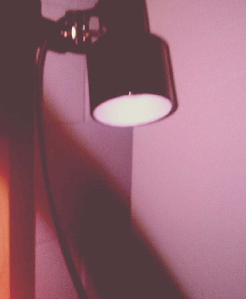
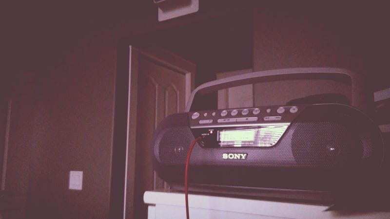
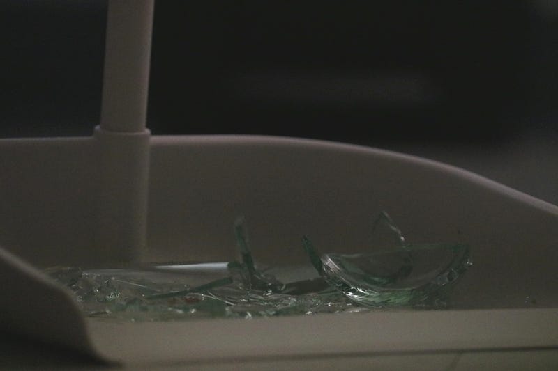
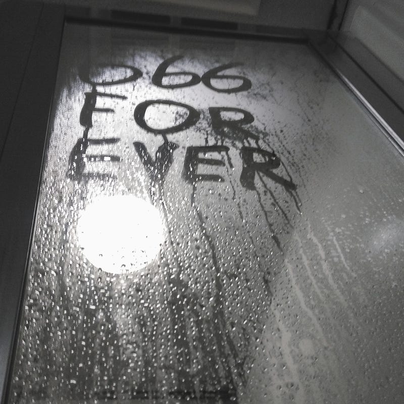
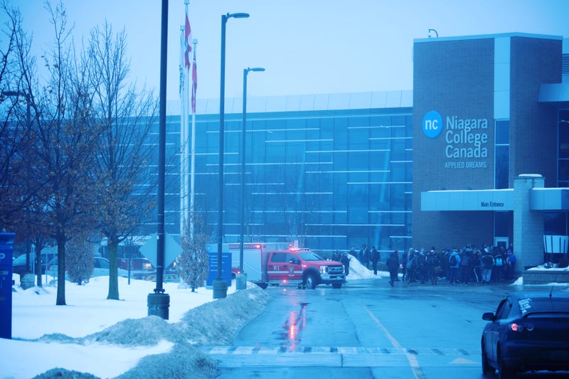
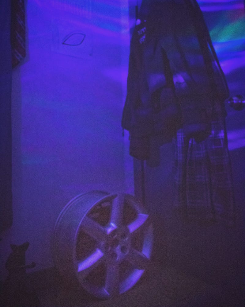
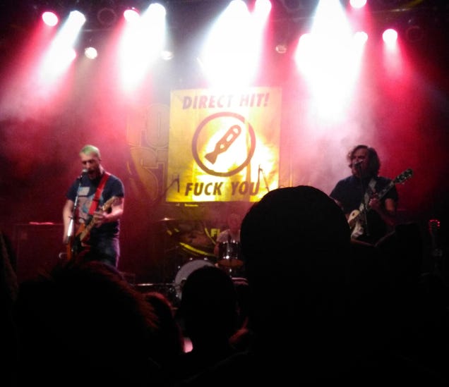
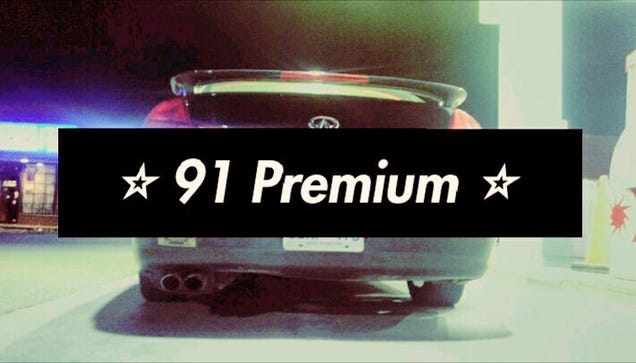
I've been back at it again with even more mediocre lo-fi stuff.


Hopefully at least some of you guys find some of it enjoyable.

1 2 3

You'll need to log in to post.

Our Preferred Partners
wLzO7R4aNCE1UknGSO6LbnaxepmBhbvmnwGR2EYlfGA8EzMda6wr7jXt5WrD54Oi