Vertical styling elements at the outer edges of the front end. I think it started with Toyota

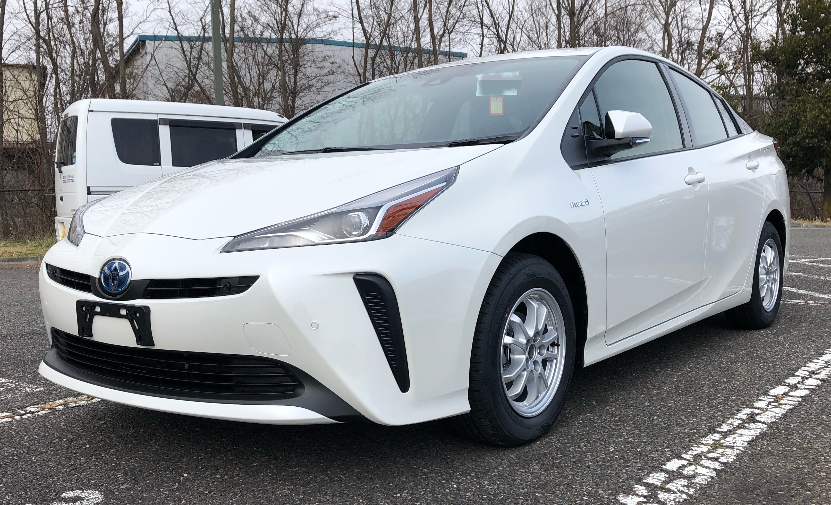
Which was like, OK, the Prius is weird and ugly, but it spread to everything else

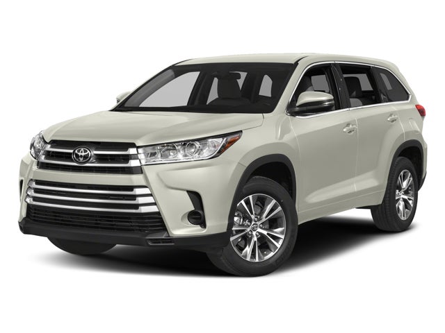

Then I was like, OK, Toyota wants to be known for ugly cars, this HAS to stop with them, but they kept showing up





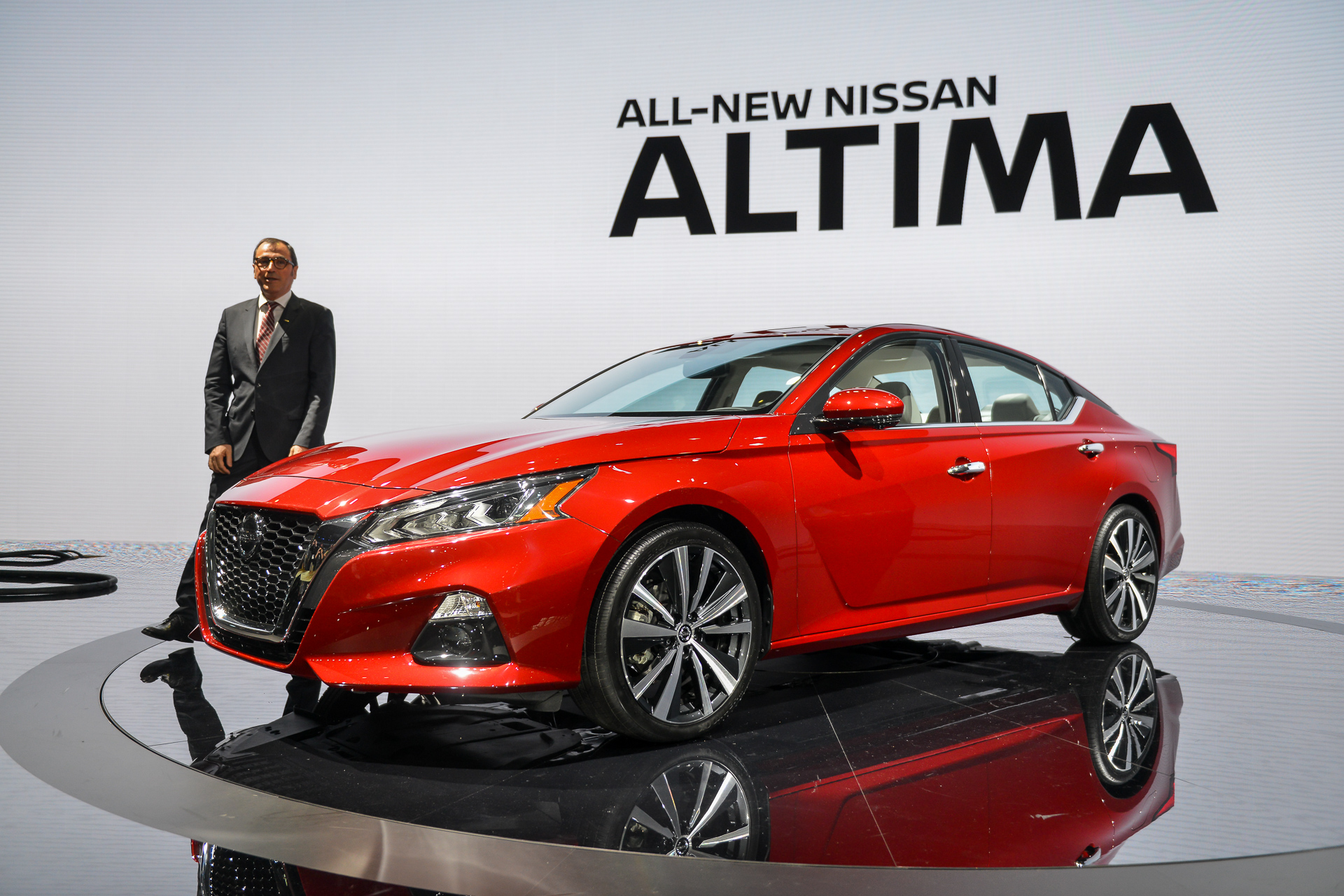
Nissan was all like "We are adding ugly vertical elements to the lower corners of our entire lineup, yeah!"


Luxury is on board with the trend
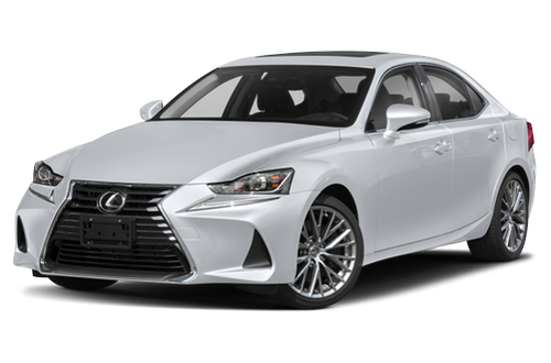


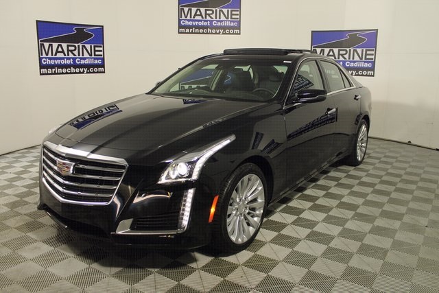
And the element is de-rigueur for fuel cell cars


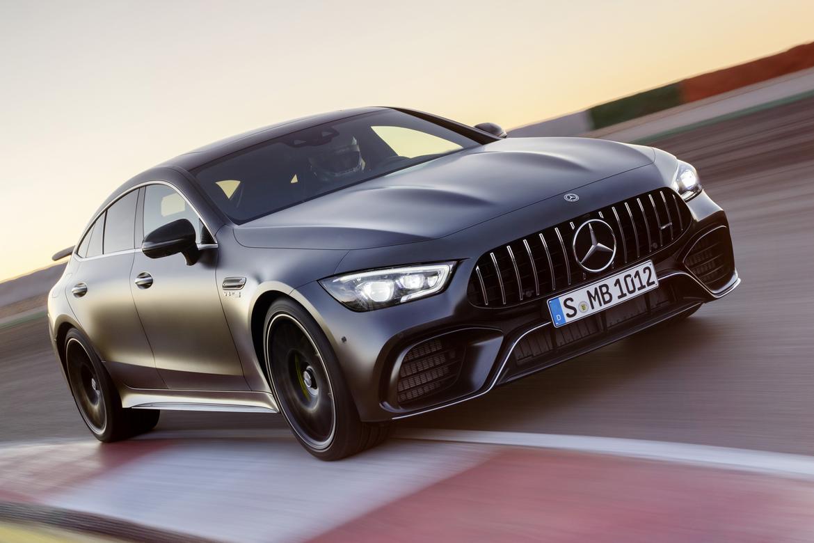
Mercedes at least avoid vertical lines and goes for the fish-mouth look, which at least can pass for brake-cooling ducts (even though most are not)
BMW is inexcusable

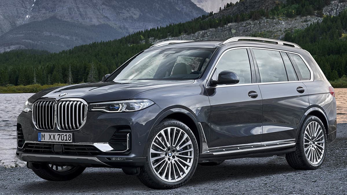
(grrrppphh) Sorry, I threw up in my mouth a bit seeing that last one.

Volvo?
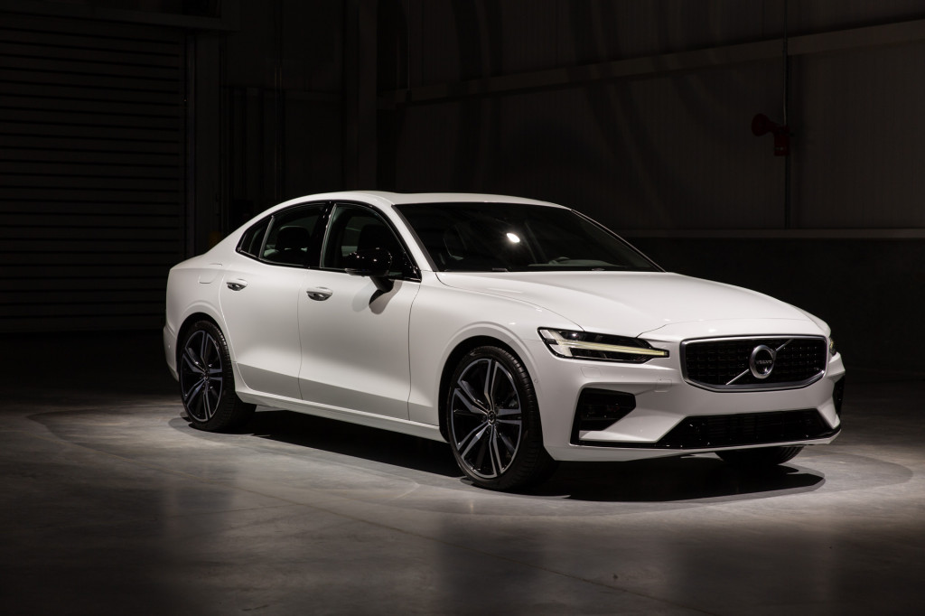
Check. Geely?

Check. Dodge/Chrysler seems to be avoinding it, but that's mostly because they only make 4 cars and they are all old designs. Alfa?

Yep. Lamborghini?
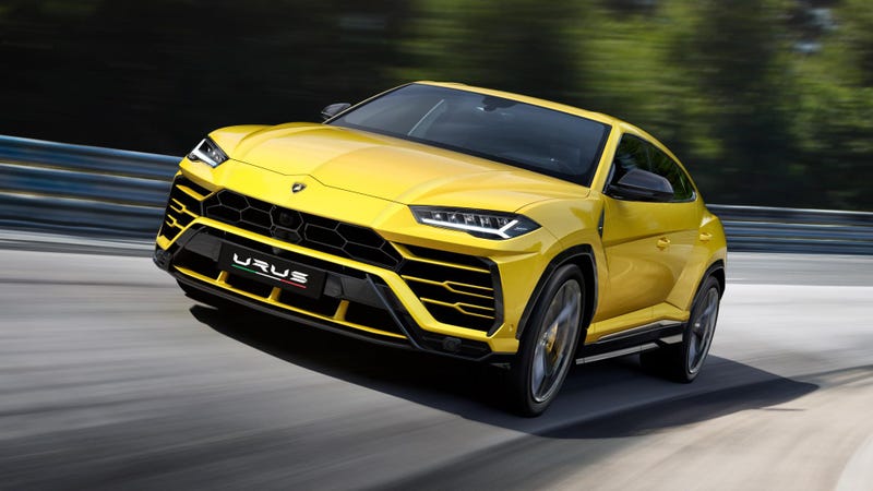
Oh crap. Eh tu VW?


Oh I give up, there will be no cars without this abomination in 5 years .

wae
SuperDork
2/21/19 9:10 a.m.
Doesn't it have to do with trying to comply with the NCAP pedestrian safety standards or something like that?
I mean, I'm the one paying for the car so it should be designed to protect me, not the fool that walks in front of me, but whatever...
I have no love for those elements, but the Lexus SUV you linked...well, it may have them, but my eyes burned out of my skull when they latched onto the grille, so I'm blind now.
It's only bad if you don't like it. I only see that part of my car for 10 seconds or so when I'm getting into it, in any case.
Enthusiasts dislike current automotive design. In other news, the sky is blue and gravity is still functioning. Somewhere in 1965 there was a guy leaning on a diner counter bitching about how little chrome and total lack of fins on that new Mustang thing.
I call those the Canine Vents because they remind me of fangs.

TJL
Reader
2/21/19 9:30 a.m.
I cant get past the trend of front ends that look like predators mouth or a gulping ugly fish.
I’m glad i have no intention of buying a new car. I’ll stick to cheaper older stuff with much better styling and no predator face.
I don't see them as categorically bad...some look bad, some look good. Notice that most of the cars you linked don't have a krill grille - and that is a styling trend that I categorically hate. So trading krill grilles for canine vents would be an improvement IMO.
As a design theme it has been around a long time... looks like K.I.T.T. is a distant cousin as well.

FWIW, I tend to dislike any trend that makes all cars look alike.
I like to see independent style, not cloned marketing.

Duke
MegaDork
2/21/19 9:40 a.m.
I call them predator / warthog tusks. They are not inherently awful - a very small number of the cars you posted are not bad looking (Volvo, Alfa).
But like anything else, that element's success is a matter of proportion. And automakers have not only incinerated the very concept of "proportion" but also scattered its ashes on unhallowed ground plowed with salt to make sure it never comes back.

Duke
MegaDork
2/21/19 9:45 a.m.
a_florida_man said:
FWIW, I tend to dislike any trend that makes all cars look alike.
I like to see independent style, not cloned marketing.
I prefer handsome, well proportioned design to hideous-but-identifiable brand image. I'll gladly accept a little similarity across manufacturers to avoid the garish LOOK AT ME LOOK AT MMMEEEEEEEEEEE!!!!!!!!!! excesses necessary to out-style the competition.
Duke said:
a_florida_man said:
FWIW, I tend to dislike any trend that makes all cars look alike.
I like to see independent style, not cloned marketing.
I prefer handsome, well proportioned design to hideous-but-identifiable brand image. I'll gladly accept a little similarity across manufacturers to avoid the garish LOOK AT ME LOOK AT MMMEEEEEEEEEEE!!!!!!!!!! excesses necessary to out-style the competition.
This...remember that the Lexus predator grille was made for "uniqueness."
I'm impressed it bothered you enough to hotlink that many images!
I agree with Gameboy though, some look good, some don't.
I love the way the new M2 looks.
I believe this is known as the "Get off my lawn!" styling elements. Old people hate them.
Seeing them on Toyotas eco cars makes me wonder is they're either aero positive or at the very least, not aero negative.
I've been calling toyota and honda's styling "origami meets anime".

T.J.
MegaDork
2/21/19 10:10 a.m.
I dislike how many new cars have a vertical surface around the wheel wells. That drives me nuts. It's like they want to give the impression of larger wheel openings when the tires/wheels are already huge compared to 15 years ago. I've been unsuccessful at figuring out the name of this styling element, but I don't like it.
It is like zero width flares. Seems like they designed the bodies for larger wheels/tires and then had to add an inch all around the opening to fill in the gap when they realized they couldn't get away with 22" wheels or something.
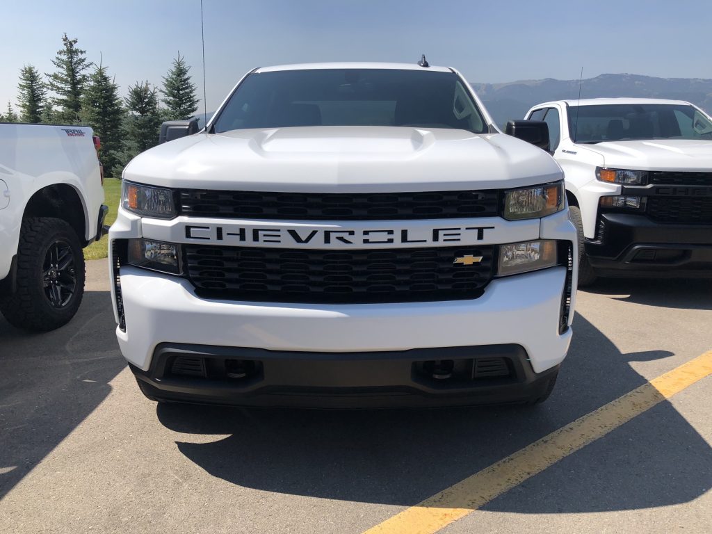
You forgot one of the worst offenders besides the Toyota ecoboxes.

wae
SuperDork
2/21/19 10:22 a.m.
T.J. said:
I dislike how many new cars have a vertical surface around the wheel wells. That drives me nuts. It's like they want to give the impression of larger wheel openings when the tires/wheels are already huge compared to 15 years ago. I've been unsuccessful at figuring out the name of this styling element, but I don't like it.
It is like zero width flares. Seems like they designed the bodies for larger wheels/tires and then had to add an inch all around the opening to fill in the gap when they realized they couldn't get away with 22" wheels or something.
There was a jalopnik(?) article about this a day ro two ago, actually. Apparently the answer that came back was that the flat spots are there to provide structural rigidity to the stamping.
I, too, am not a fan.

Duke
MegaDork
2/21/19 10:25 a.m.
wae said:
T.J. said:
I dislike how many new cars have a vertical surface around the wheel wells. That drives me nuts. It's like they want to give the impression of larger wheel openings when the tires/wheels are already huge compared to 15 years ago. I've been unsuccessful at figuring out the name of this styling element, but I don't like it.
It is like zero width flares. Seems like they designed the bodies for larger wheels/tires and then had to add an inch all around the opening to fill in the gap when they realized they couldn't get away with 22" wheels or something.
There was a jalopnik(?) article about this a day ro two ago, actually. Apparently the answer that came back was that the flat spots are there to provide structural rigidity to the stamping.
I, too, am not a fan.
Luckily, they've been going out of style for a while. The real heyday of that wheel arch bit was maybe 10 years ago, right about the time Subaru took one of the handsomest mid-level sedans ever made and turned it into a steaming garbage scow.
I agree that some look better than others, I just don't like the idea that so many designers are jumping onto a bandwagon started by an ugly car. I mean, what would happen if every car maker starting copying the Aztec and messed-up headlight and turn signal arrangements?
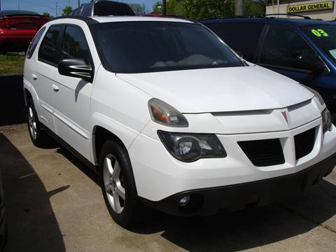
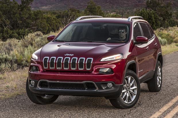
Oh wait...
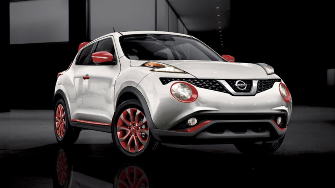
Oh crap
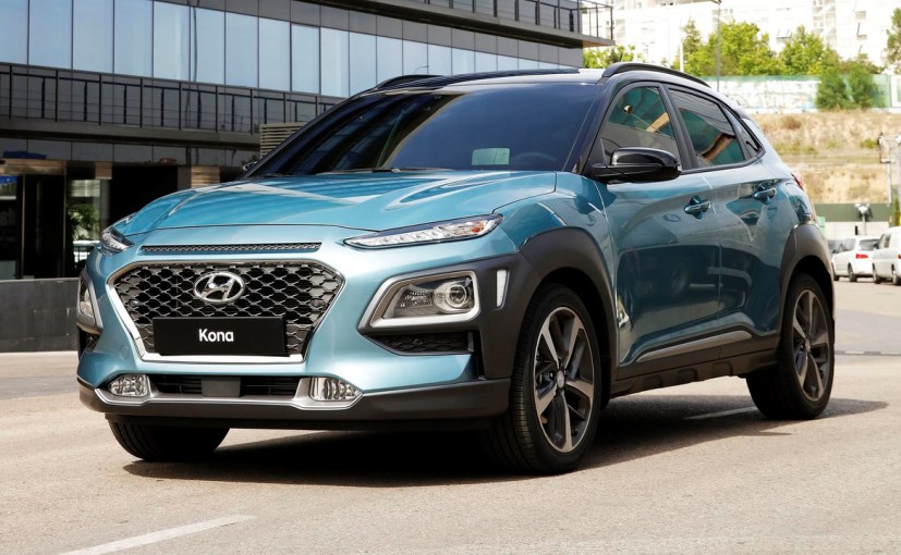
Seriously?

Barf. See? It gets out of hand quickly.

dps214
New Reader
2/21/19 10:27 a.m.
Huh...I'm usually the one unwilling to accept odd styling. The vertical front bumper feature isn't my favorite thing ever, but all the ones where it's not overpowering (like less than ~1/2 the height of the front fascia) are just fine. And I have no real issue with the vertical fender edge. I mean I'm sure somebody will find a way to overdo it eventually, but for now I haven't seen one that was truly a problem. And it's far from a new development...I own two cars designed in the mid-90s that have that feature, and it looks like BMW was doing it at least as far back as the E30. At some point it almost seems like we're just making up reasons to dislike modern cars.


 it's the plague


